Launch the app your
business deserves.
You bring the idea. We design, build and ship it — on time, on budget, and yours to keep, every line.
Apps we've built that grew real businesses.
Live applications, shipped for paying clients, with outcomes that mattered. Click any to read the story.
You're not afraid of features.
You're afraid of five things.
Building an app is a leap of faith. We built the whole team around removing every reason it usually goes wrong.
The cheapest quote is the most expensive mistake.
Most failed app projects didn't fail on price — they failed on what a low quote quietly leaves out.
A process built to de-risk your investment.
Five stages, each one closing a reason app projects fall apart — a fixed price agreed up front and visible progress the whole way through.
Discovery
We pressure-test the idea before a line of code is written.
Fixed plan & price
Scope, a visual prototype, and a fixed price — agreed up front.
Build in the open
Two-week cycles, a testable version each time. No black box.
Rigorous testing
Speed, security and stability, checked on every device.
Launch & handover
100% ownership transferred — plus 30 days of hyper-care.
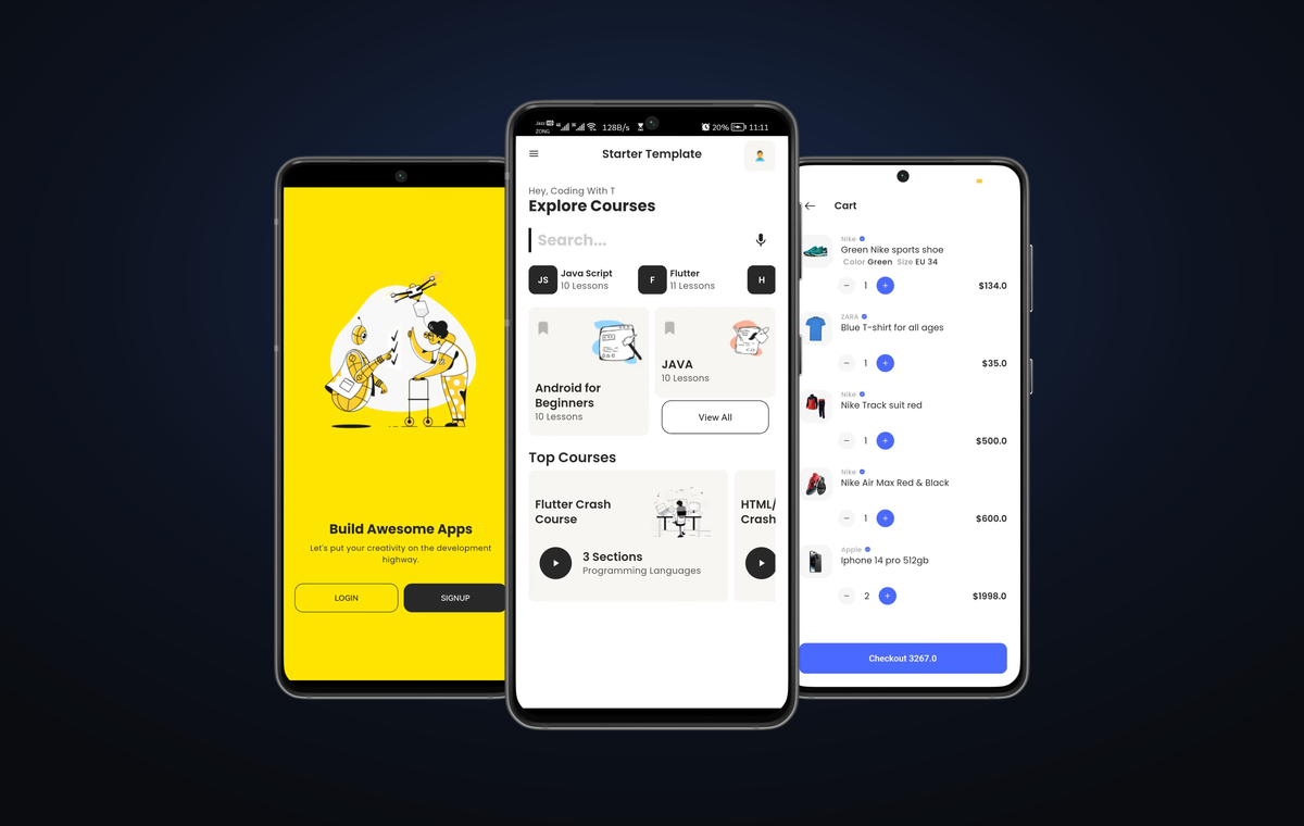
Everything your app needs — including intelligence.
From the first screen to the smartest feature, we build the whole product. One team, one accountable partner.
Mobile apps
One codebase, both app stores. Native-quality iOS and Android products built to scale with your business.
Web platforms
Dashboards, customer portals and admin systems engineered to handle real traffic and real data.
AI-powered features
Want your app to recommend, automate, answer or generate? We build intelligent features — smart assistants, recommendations and automated support — into your product. Tell us what you want it to do.
Design & UX
In-house product design built to convert, not just to look good in a portfolio.
Rapid MVPs
A working product in weeks, so you can test the market before you over-invest.
Support & growth
We don't disappear at launch. Ongoing support and iteration to keep your app ahead.
The people we've built for.


Plan your app — get a quote.
A few guided questions shape your idea into a clear brief. Send it over WhatsApp or email and we'll reply with a tailored quote within one business day.
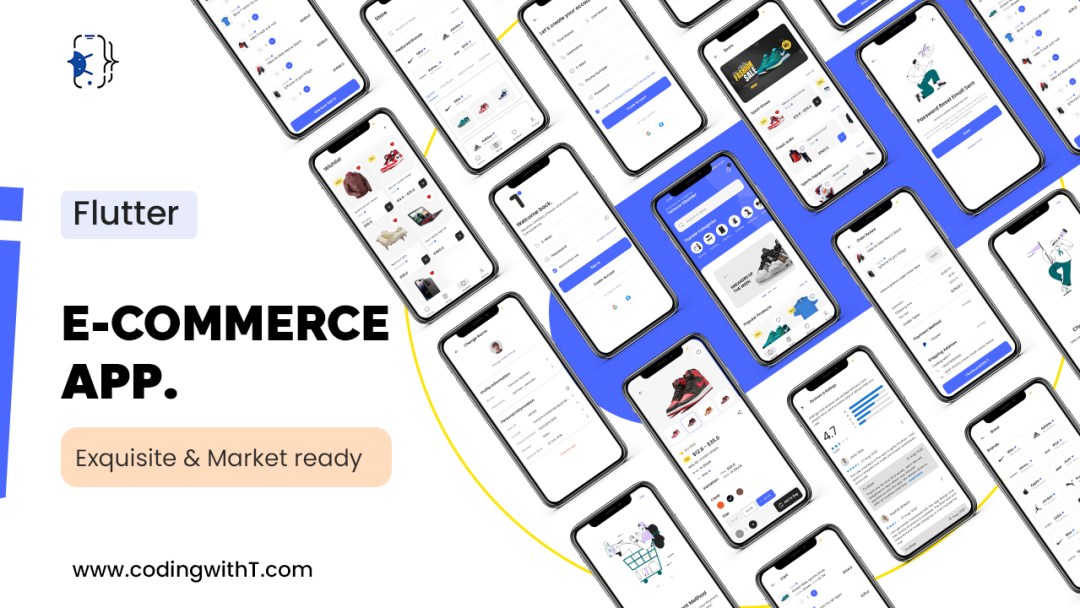
Plan your app →Not ready to hire a team? Buy the code.
The same production-ready apps and kits we build with — downloaded by 3,900+ developers worldwide.

Whatever your business, we've built for it.
From rentals to retail to healthcare, we've shipped apps across the sectors below. If your industry is here, we already understand your users and your challenges.
◰ Rentals & marketplaces
Car rental, property & plot listings, equipment hire, peer-to-peer marketplaces, booking platforms
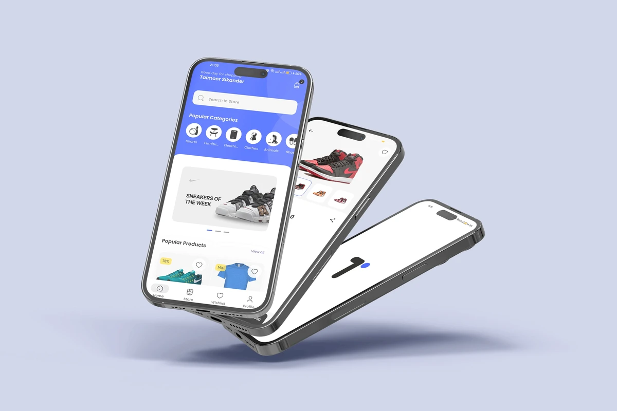
◱ E-commerce & retail
Single & multi-vendor stores, fashion, grocery, D2C brands, in-app payments & checkout
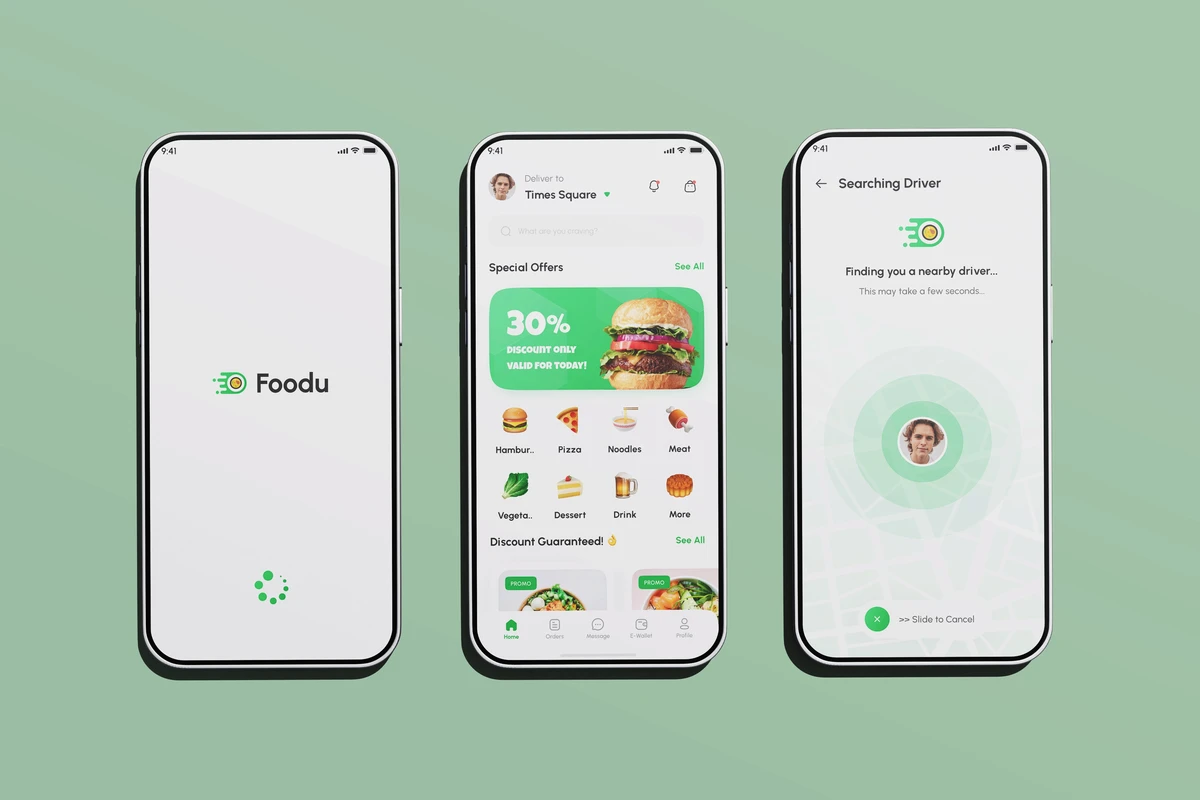
◲ Food & delivery
Restaurant ordering, on-demand delivery, rider & dispatch apps, cloud kitchens
◳ Health & wellness
Telemedicine, medicine delivery, fitness & coaching, appointment booking, clinic management
◴ Fintech & payments
Wallets, lending, expense tracking, subscriptions, secure transactions
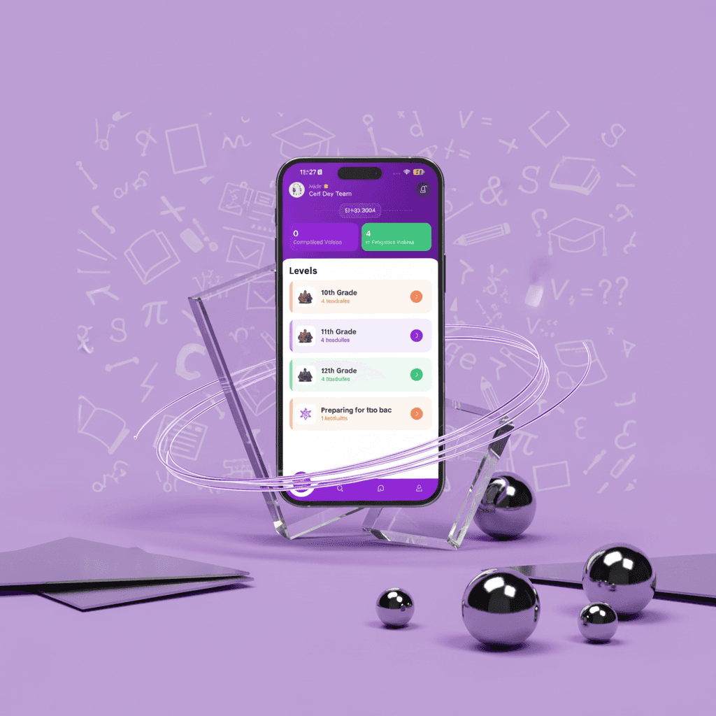
◵ Education & learning
Course platforms, LMS, tutoring marketplaces, student engagement apps
◶ Services & on-demand
Home services, worker & labour hire, field-service management, bookings
◷ Social & community
Membership apps, social feeds, creator platforms, event & club apps
◰ Logistics & real estate
Fleet & delivery tracking, property management, agent CRMs, listing portals
Built on the right tools for your project.
We're not locked into one stack. We pick the languages, frameworks and databases that fit your app best — and keep your running costs low.
You don't need to know what any of these are — that's our job. They're simply the proven tools behind apps that last.
The questions every founder has.
Not ready to talk? Start here.
Get our free guide: "How to build an app without getting burned" — the seven questions to ask any developer before you pay a penny.
No spam. Just the guide and the occasional genuinely useful email.
We make your idea better before we build it.
Before anything is built, we help you sharpen the concept — the features it really needs, and the lower-cost technology choices that still perform. You get a stronger app for less.