Velvet — eCommerce
An editorial shopping experience that doubled mobile sales.
Overview
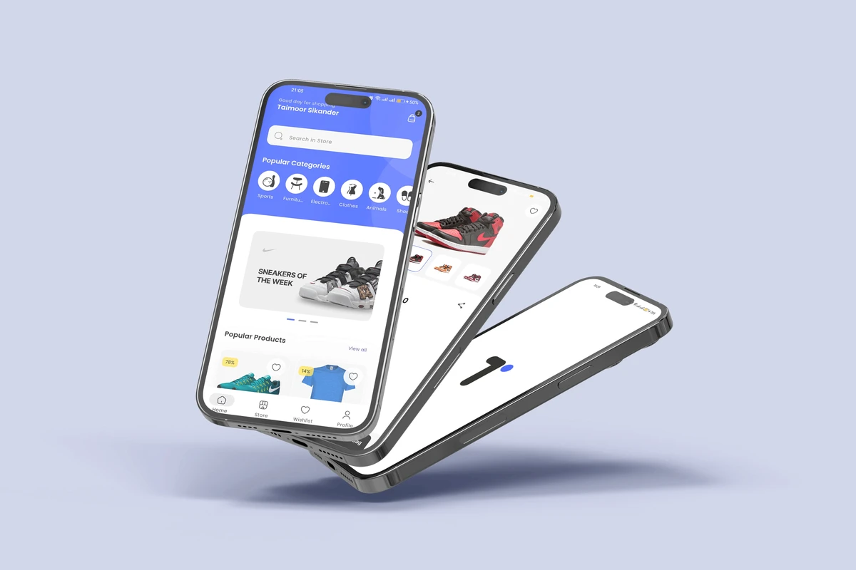
Velvet reimagines the product catalogue as a luxury-magazine journey — immersive editorial design fused with one-tap purchasing.
The challenge
Shoppers browsed for ages but abandoned carts on cumbersome, cluttered navigation. The gap between discovery and checkout was quietly killing conversion.
Our approach
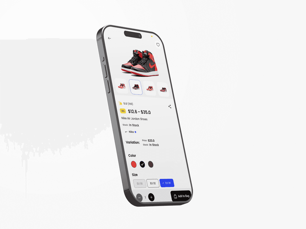
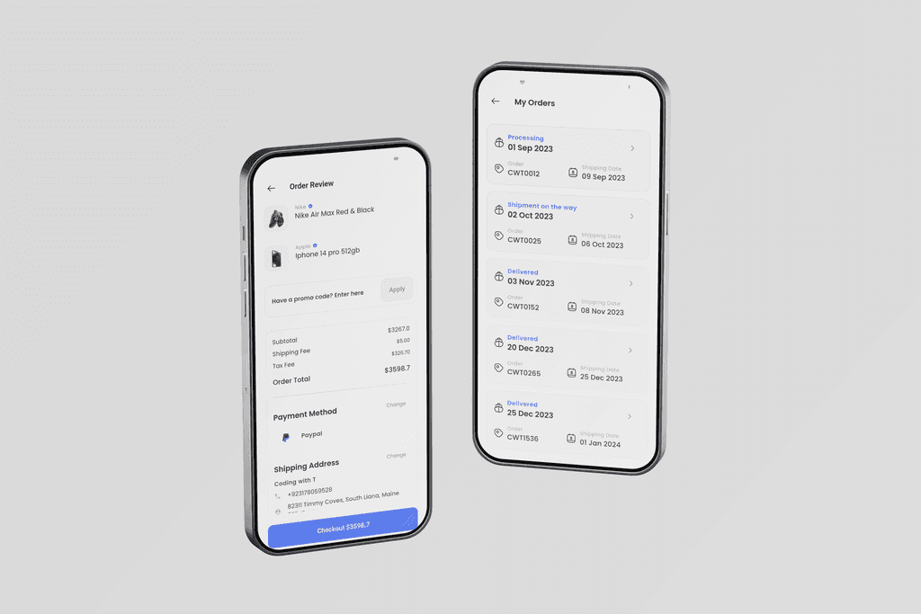
We built a Card-First interface around negative space and product imagery, kept category context inside the feed, and stripped the payment flow with a sticky Add-to-Cart plus Apple Pay and Google Pay on the product page — cutting purchase steps in half.
What we built
- ✓ Card-first, editorial product feed
- ✓ Dynamic Size / Colour / Brand filtering
- ✓ High-res zoom & sizing guidance
- ✓ Sticky add-to-cart for conversion
- ✓ Apple Pay & Google Pay on product pages
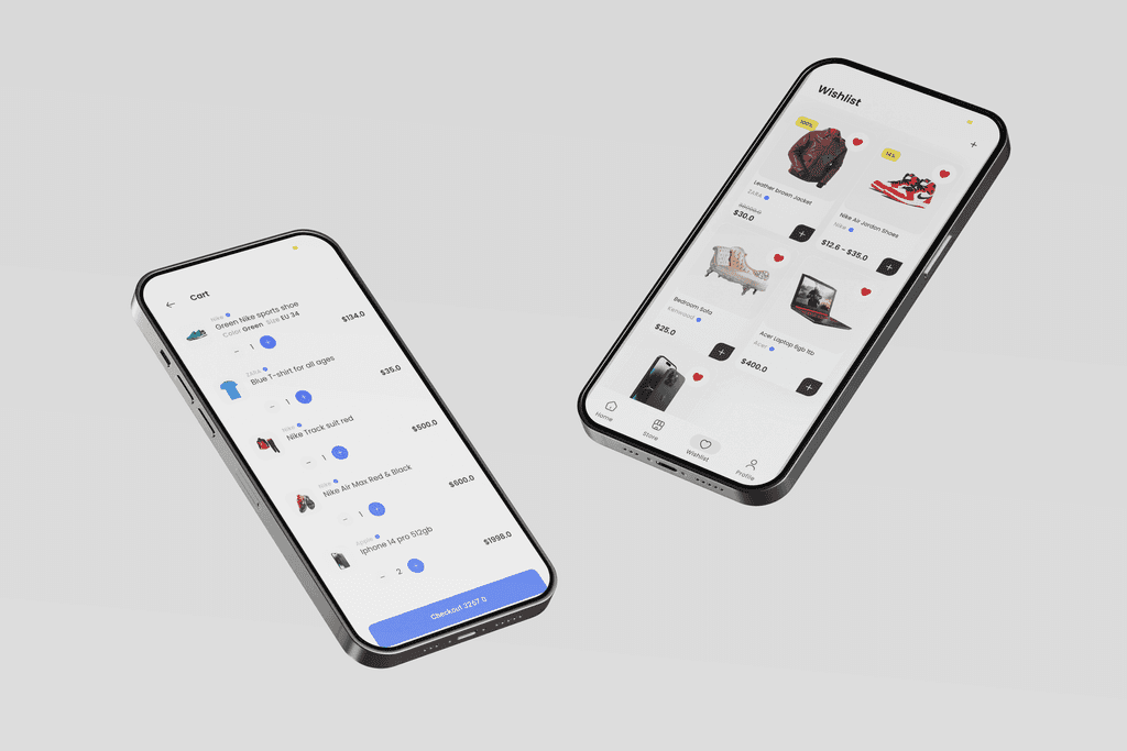
- ✓ Linear checkout — 50% fewer steps
Under the hood
Editorial, card-first UI
We turned a product catalogue into a luxury-magazine browse, keeping category context inside the feed.
Checkout in half the steps
A linear flow with Apple Pay and Google Pay on the product page cut purchase steps by 50%.
Engineered for scale
The backend held 10,000+ concurrent users with no performance degradation.
Conversion-tuned details
A sticky add-to-cart, high-res zoom and sizing guidance closed the gap between interest and purchase.

The outcome
Cart abandonment fell 35%, sessions doubled versus the old mobile web, and the backend held 10,000+ concurrent users without degradation. The client reported mobile sales doubled since launch.
- ↑ 35% drop in cart abandonment
- ↑ 2× longer sessions vs the old mobile web
- ↑ Mobile sales doubled after launch
- ↑ Shipped in 12 weeks